Wednesday, March 7, 2007

Golden State Warriors Logo - Final Version

At long last - i am done with the Golden State Warriors logo.

The final 6 were chosen, printed, and mounted on Monday, then submitted yesterday.

I snapped a photo before I handed it in:
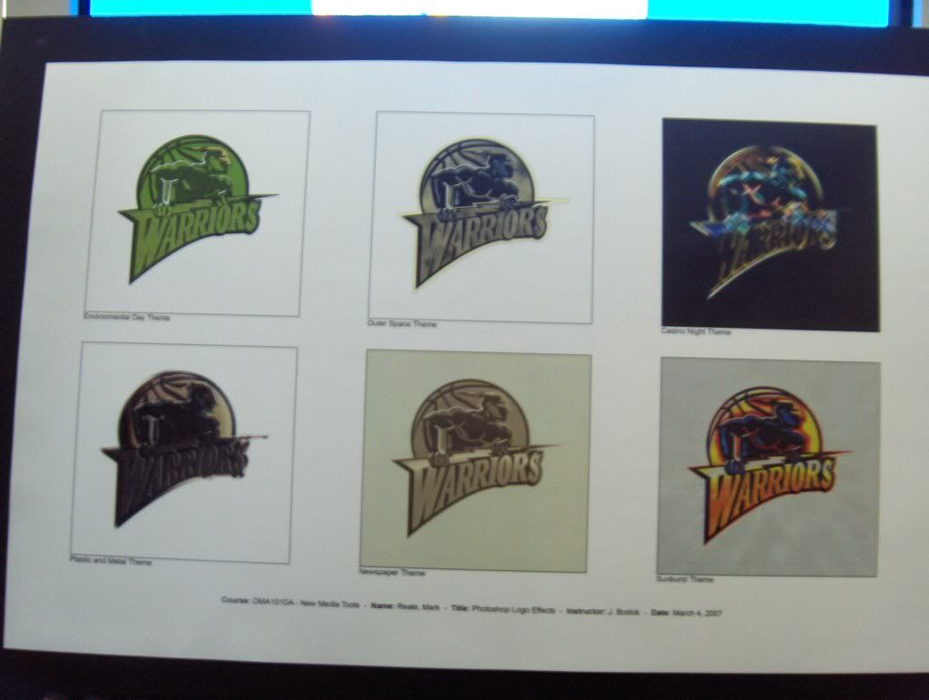


Obviously there was all sorts of problems:

- the school print shop ran out of ink so i had to venture elsewhere in the -30 celsius weather to get the shit printed
- the case i brought with me to hold the printed logos turned out to be too small, so i had to exercise extreme caution carrying the paper back to school in the driving wind
- the final layout somehow looked off balance - all the colorful logos were on one side and the monotone logos were grouped together - couldve used a bit more tact
- decided to use that cursed rubber cement again (still hate that shit)
- none of the star detail in the Outer Space themed logo showed up in the printed version

All in all tho - the final product looked pretty dope.

I'm familiar enough with Photoshop now to get some things done, and I know that there is a wealth of resources available on the internet if I find myself out of ideas.

Labels: , , , ,

Saturday, March 3, 2007

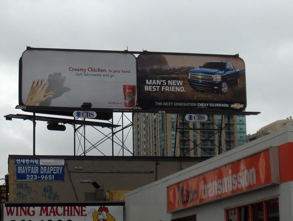
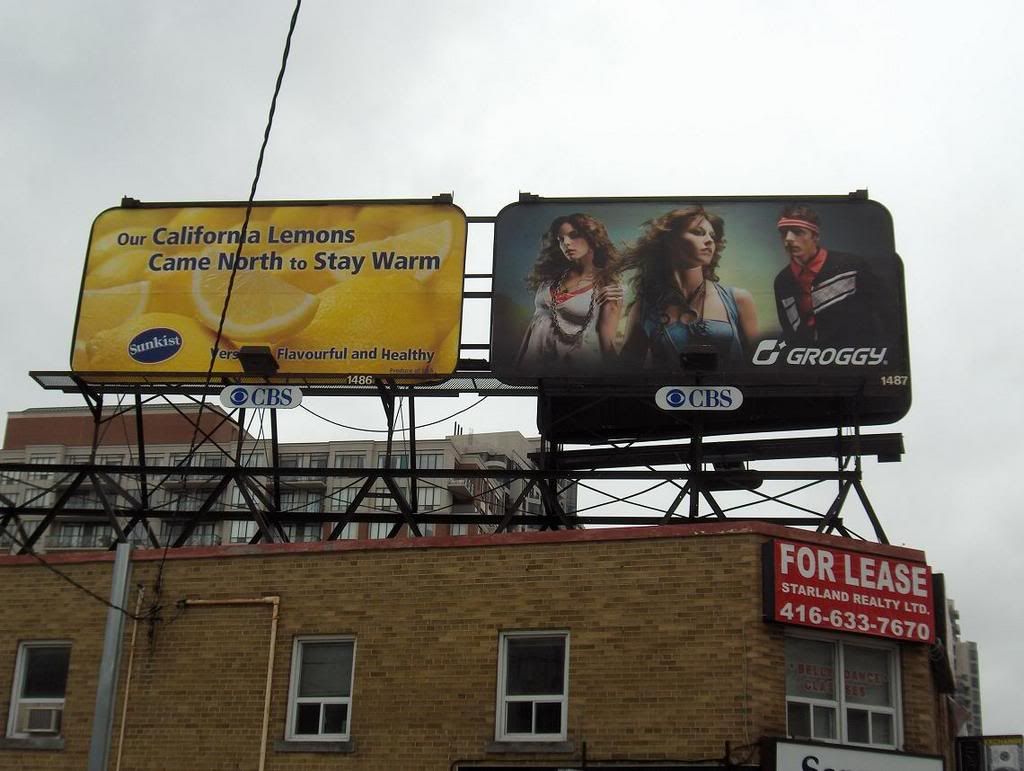
Investigative Report #2 - CBS Watching Toronto?


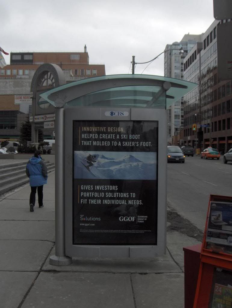
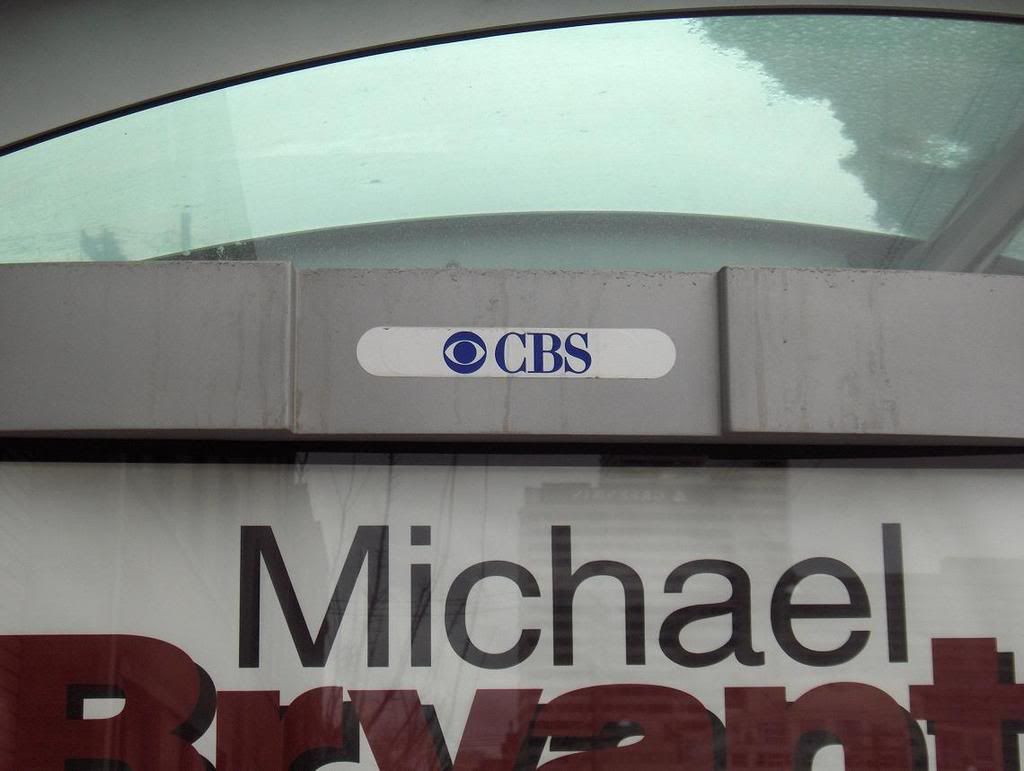
A while back I remember noticing a CBS logo on a bus shelter, and I remember wondering why the hell there would be a CBS logo on a bus shelter in Toronto?

The I remember seeing CBS logos on several bus shelters.

Then I noticed it on subway advertising spaces.

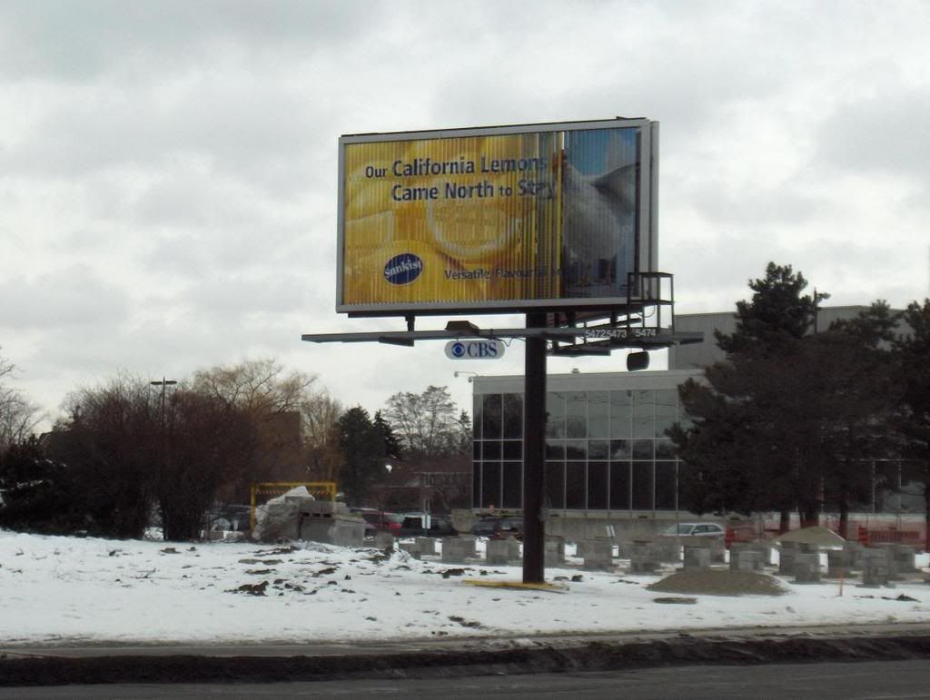
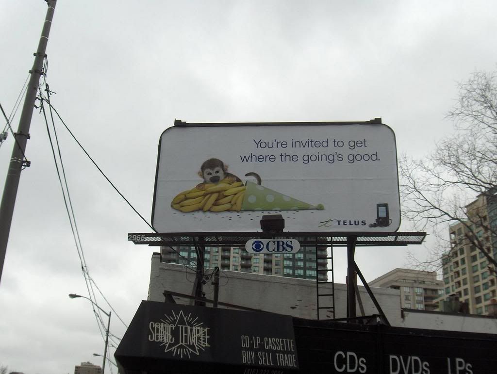
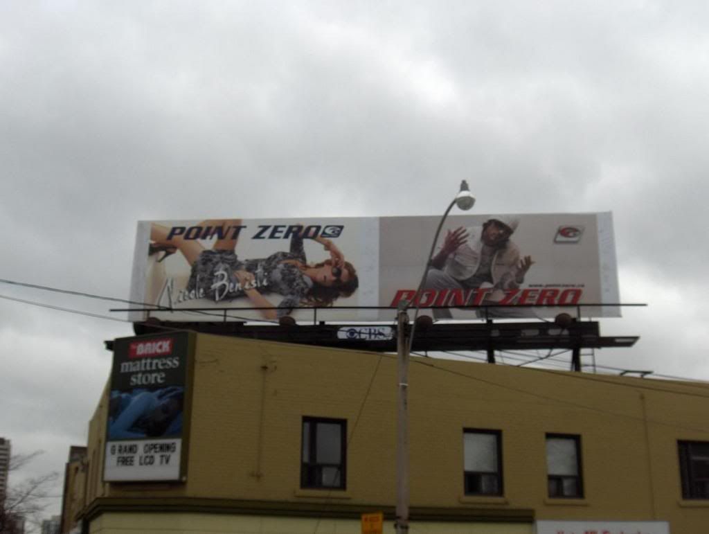
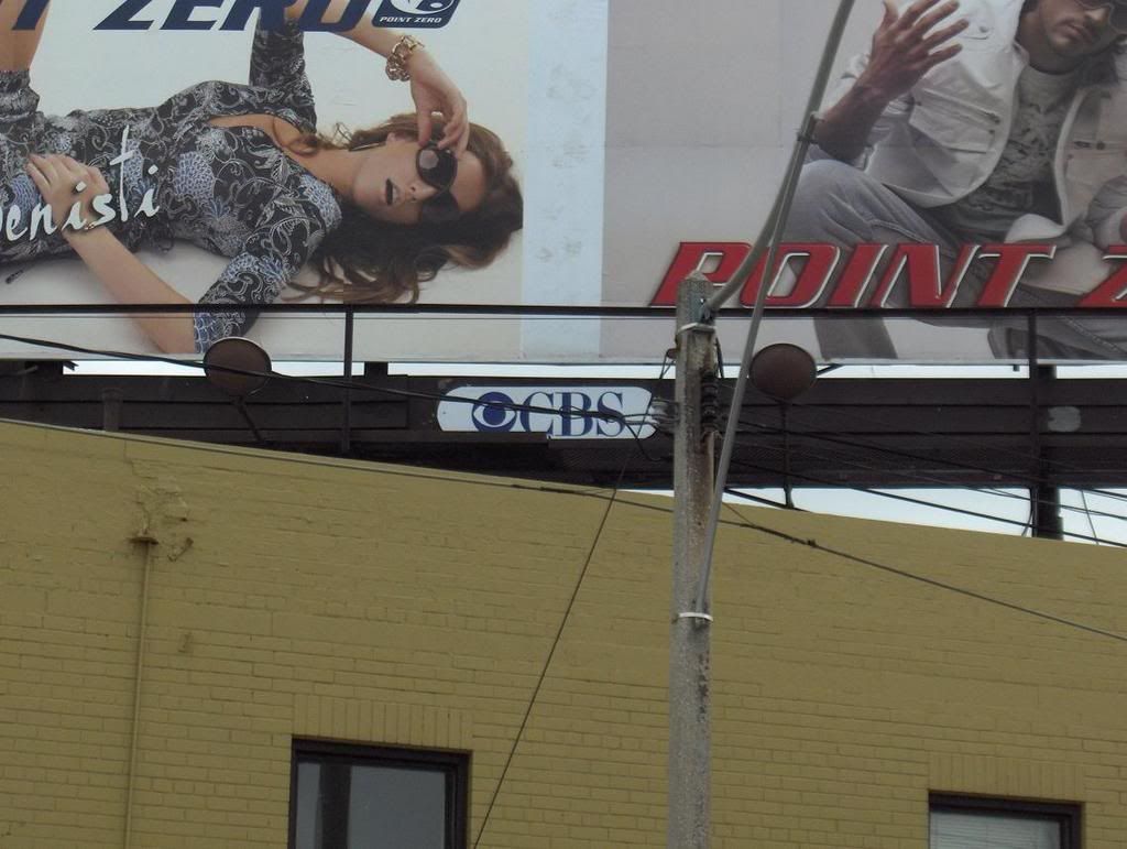
Then I noticed it on billboards.

Man - it's everywhere.


These photos were all taken within a matter of about a hour-and-a-half walking around by foot.

You might not be able to see the logos at first glance in the small images, but if you click to get a larger view, you will see them clear-as-day.


If you live in Toronto, once you see the logo, you will probably notice it absolutely everywhere you go.

I did a basic search on Google to try to figure out what the deal was. As it turns out, there is a company owned by CBS/Mediacom called CBS outdoor which apparently controls all advertising on Toronto public transit (since 1997).

The thing that I find most strange about the CBS logo - and I'm not sure how many people agree - is that it doesn't really look like a gigantic eye at first. I remember seeing the logo as a kid, and for the longest time it just looked like a circle within a circle. But once I caught on that it is a eye - I can't help but wonder if they tried to make it look so unsettling on purpose.

A major American broadcasting network with its logo plastered all over Canada's largest city.

A big eye stuck open.

Cyclops.

Watching.

It sure lends itself to considering some wild shit.

Stick that logo on a pyramid and people would go apeshit.

If you're into that kind of stuff.

I got a ton more photos of CBS logos in Toronto streets and public spaces if anybody outside the city wants to see prevalent they are.

Just let me know.

1

Labels: , , , ,

Friday, February 16, 2007

Illustrator designs

i messed around for a little while in Illustrator as well today to put together some new designs for use on internet forums:


avatar:

signature:


im feelin the simplicity of the Light House logo fo sho

after learning design basics in multimedia class, it feels like i cant go wrong


give me a bunch of rectangles and watch out

Labels: , , , ,