Saturday, March 3, 2007

Investigative Report #2 - CBS Watching Toronto?


A while back I remember noticing a CBS logo on a bus shelter, and I remember wondering why the hell there would be a CBS logo on a bus shelter in Toronto?

The I remember seeing CBS logos on several bus shelters.

Then I noticed it on subway advertising spaces.

Then I noticed it on billboards.

Man - it's everywhere.


These photos were all taken within a matter of about a hour-and-a-half walking around by foot.

You might not be able to see the logos at first glance in the small images, but if you click to get a larger view, you will see them clear-as-day.
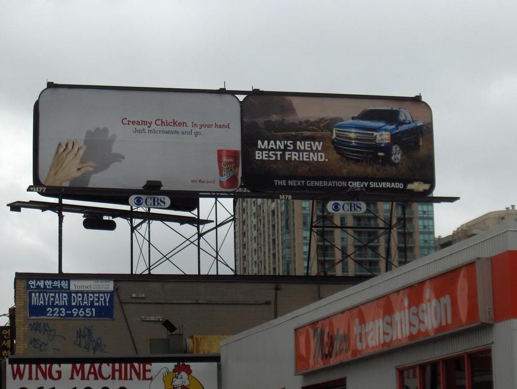
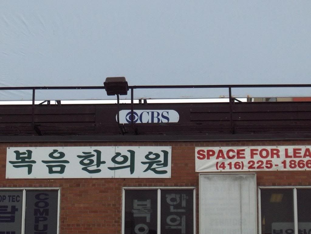
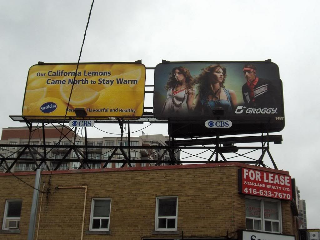

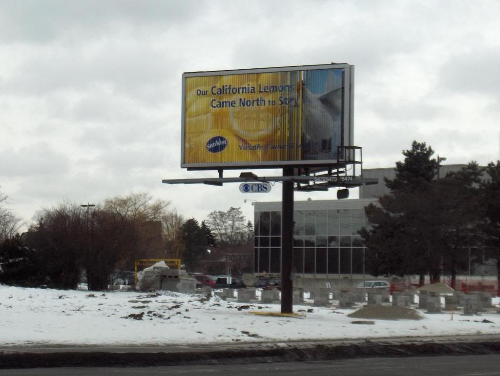
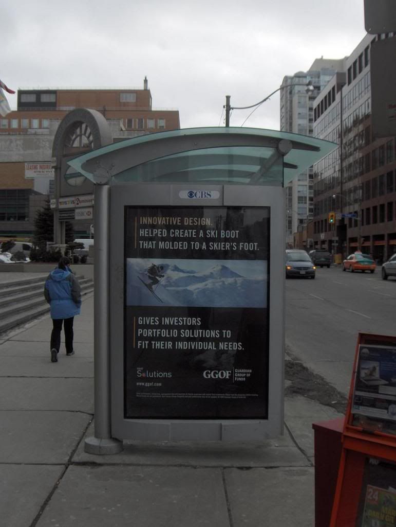
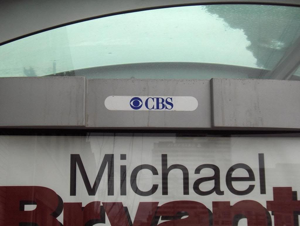
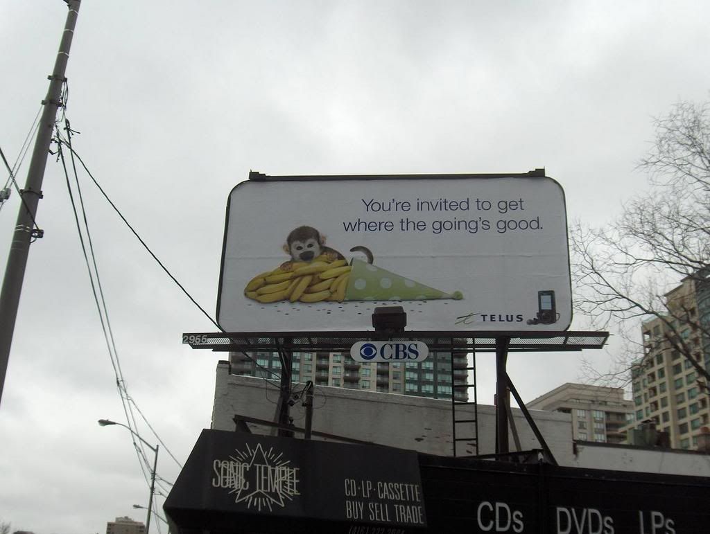
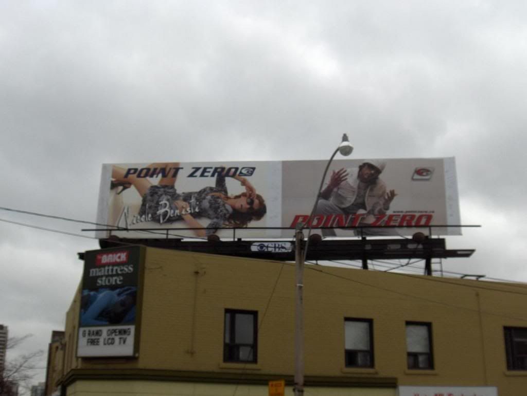
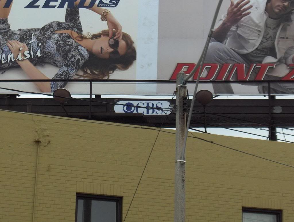


If you live in Toronto, once you see the logo, you will probably notice it absolutely everywhere you go.

I did a basic search on Google to try to figure out what the deal was. As it turns out, there is a company owned by CBS/Mediacom called CBS outdoor which apparently controls all advertising on Toronto public transit (since 1997).

The thing that I find most strange about the CBS logo - and I'm not sure how many people agree - is that it doesn't really look like a gigantic eye at first. I remember seeing the logo as a kid, and for the longest time it just looked like a circle within a circle. But once I caught on that it is a eye - I can't help but wonder if they tried to make it look so unsettling on purpose.

A major American broadcasting network with its logo plastered all over Canada's largest city.

A big eye stuck open.

Cyclops.

Watching.

It sure lends itself to considering some wild shit.

Stick that logo on a pyramid and people would go apeshit.

If you're into that kind of stuff.

I got a ton more photos of CBS logos in Toronto streets and public spaces if anybody outside the city wants to see prevalent they are.

Just let me know.

1

Labels: , , , ,

Collage Attempt pt. I

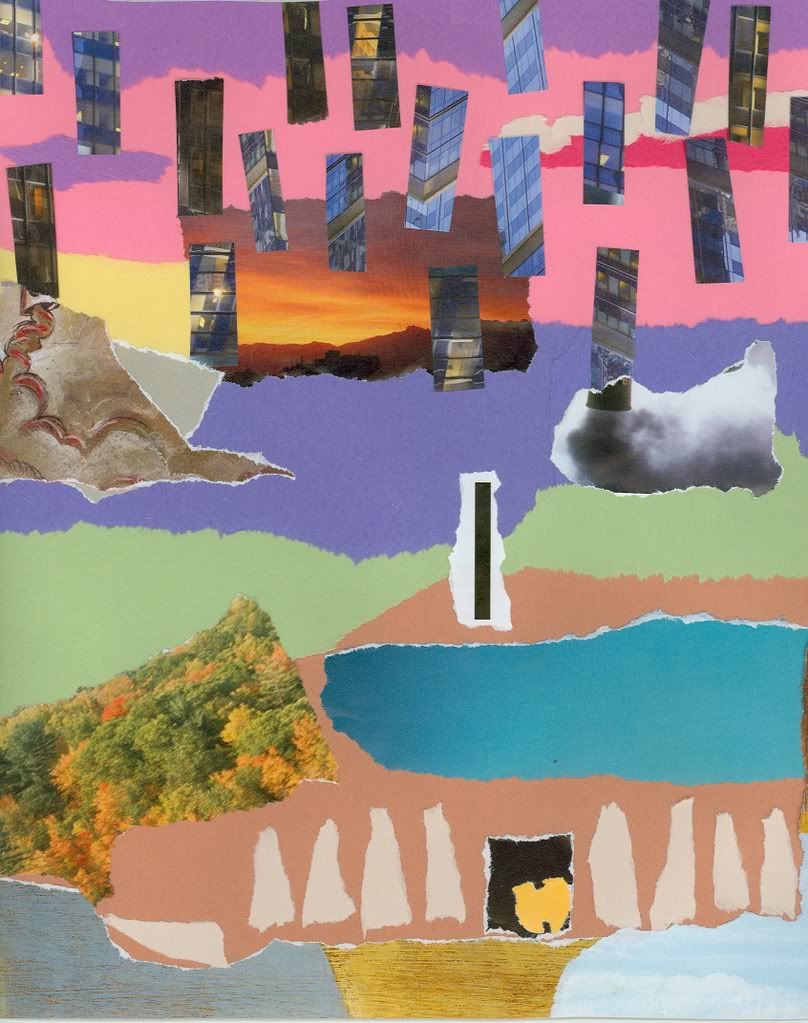
In Multimedia Design class, our latest assignment is to assemble a 10" x 10" collage.

The context of the project are that the collage will be eventually used as a CD cover and label for a musician or group.

The collage is to be abstract and attention is to be paid to the feel of the piece (you need to have a mood that you are attempting to convey).

Ideally, the mood created by the piece will reflect the genre of music you had in mind when assembling it.

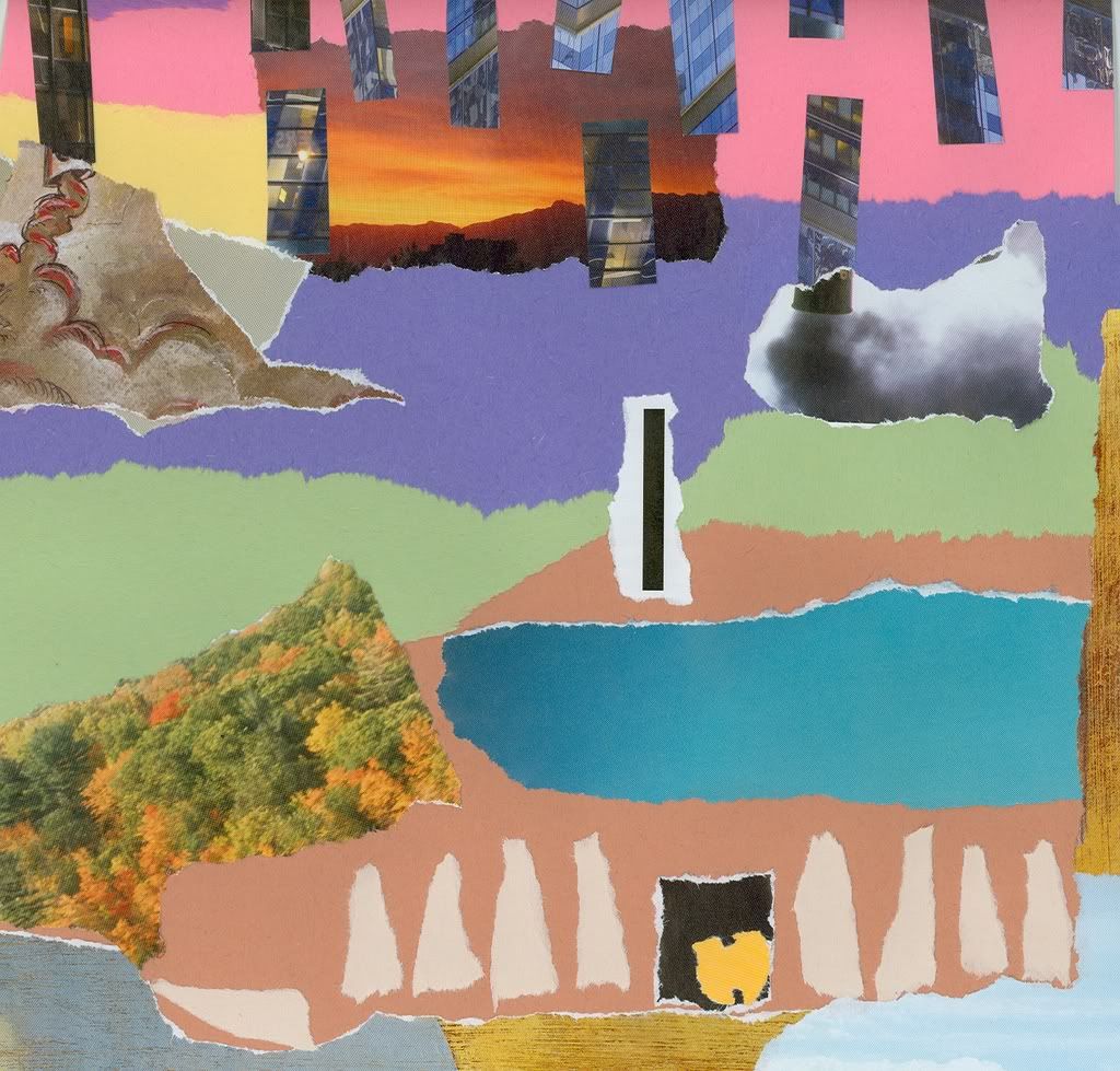
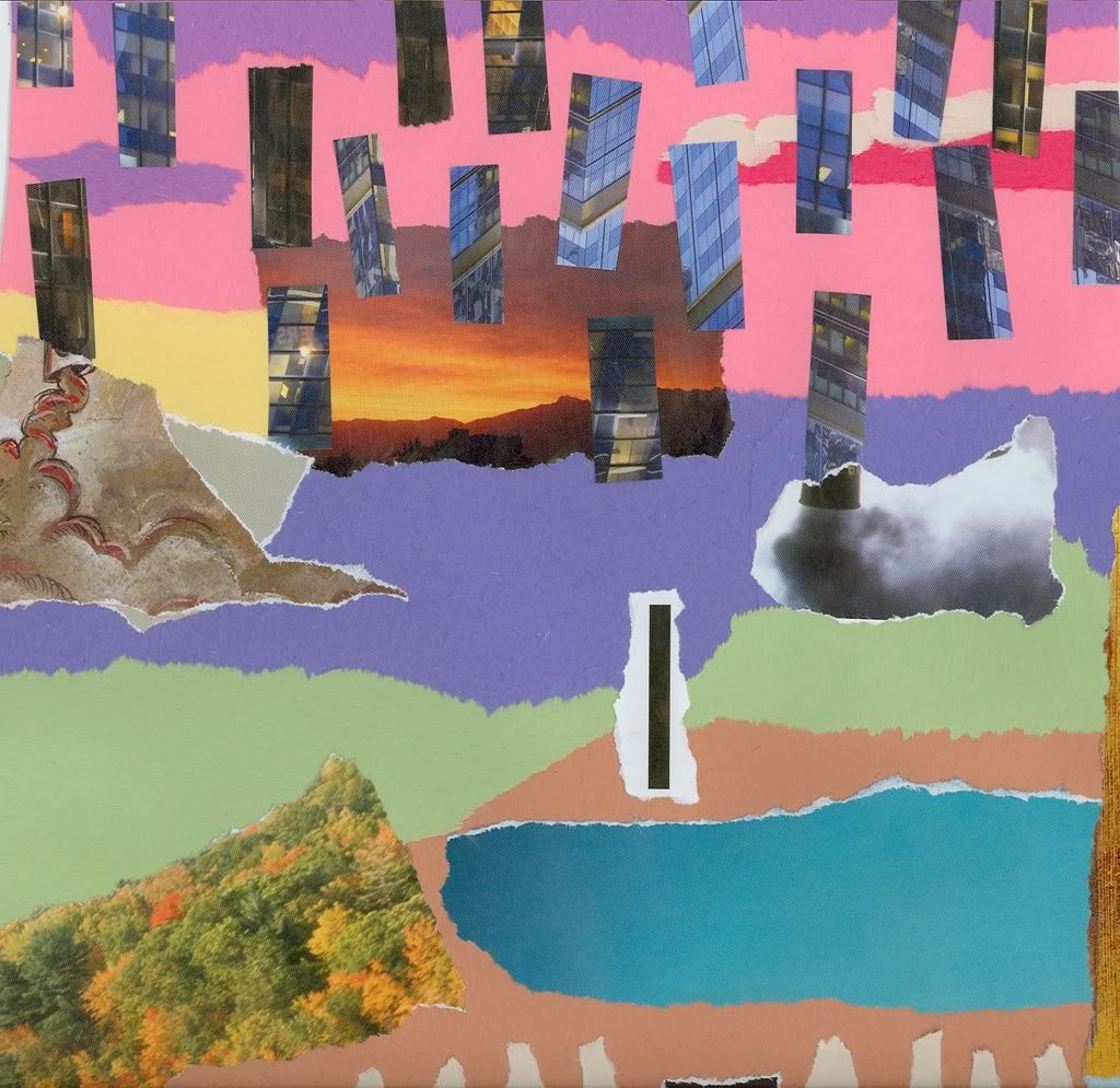
I took a trial run at putting a collage together. I don't think i have done anything like this since I was about 7.

I tried to implement some design elements into this piece, and I did to a certain degree. I didn't really like the way the colors turned out.

But after revisiting the piece (since I put it together yesterday), I don't hate it as much as I did when I first finished it.


Full piece


Bottom portion


Top Portion


Lessons learned:
- don't look for more design elements after you have already started putting the collage together
- dont start actually gluing shit until you decided thats how you want the piece to look (its not really possible to un-glue)
- if you are going to make a collage - gather as many materials together as you can and then get rid of the ones you dont need - its better to have too much than too little (and be left feeling like something is missing)


I am going to make another trial run today, and then I will assemble my final piece later this week (for class on Thursday).

Eventually we will be taking this into Media Tools class to do some digital editing on it.

I'm not too much a fan of the abstract anymore, but the creative process involved in this is soothing.

Somehow.

1

Labels: , , , , , ,

Final Logos

Ended up with 9 logos of which I choose 6 for the project to be submitted.

Here are the final 9:

1. Casino Lights


2. Plastic


3. Juicy


4. Matrix


5. Newspaper


6. Outer Space


7. Sunburst


8. Surreal / Grimy


9. Environmental Day


I posted the logos up on a couple of forums to get some feedback.

So far, the only one I am certain of ditching is #4 here

The ones that have successfully made the cut are:
Outer Space
Environmental Day
Sunburst
Newspaper

Just have to choose 2 of the 4 remaining...

Labels: , , ,

Friday, March 2, 2007

Keeping a Blog takes Dedication

so here is a cop out and a link to a pertinent article:

5 Technologies That Will Make An Impact in 2007 (thats this year)

Soon to come updates:

- 9 Warriors Logos done of which i need to choose 6
- big update on the tag project including a deeper look into the in-line skate industry (im a thorough mofo)
- also some research done on printing possibilities
- collage work for Multimedia Design class

plus some other odds and ends

i took more video walking thru a mall, but it was basically the same as the last one


also i have another little investigative report to post up here

time flies
especially when you are committed to posting on a blog that is spiralling to no-where (or who-knows-where)

Labels: , ,

Wednesday, February 28, 2007

Warriors Logo Redux

I worked on one of the logos I posted yesterday again in order to get something that looked better

Fortunately things worked out:


Im gonna put my current total at 4 subtracting the trashy looking matrix joint.

2 more

The outer space one was definitely the most inspired


we will see what happens


on a unrelated note and of no interest to anything but my digestive system, i am going to be eating a lot of spring rolls tonite

Labels: , , ,

Tuesday, February 27, 2007

Target Market: Settled

Although there does not seem to be as much cross-over appeal for in-line skates as there is for skateboarding, the target market for this project is going to be the non-hardcore skaters - so i am going to be highlighting such aspects as:
- ease
- comfort
- durability
- functionality
- utility
of the in-line skates for my campaign

i am tempted to use the innovative 2-wheel company, but since style is going to be as significant of a selling-point as functionality, i am going to stick with one of the more conventional companies.

so i am going to go with K2

their logo is straight ill and i am looking forward to working with it (although i am still not in far enough to turn back if i change my mind in the next couple days)

on my mind right now is Lupe Fiasco - a lot of sources have been hailing his album and approach to Hip Hop as a landmark in crossing Hip Hop and skater culture

reasons for this are especially evident in his video 'Kick Push':


his other video 'I Gotcha' is also dripping wiff style:


i took a trip to the mall again to check out some other labels in general - but ima save the results of that trip for the next blog post


tomorrow

111

Labels: , , , , , ,

Logos #4 + 5

Not really too happy with either of these ones, but I am getting the hang of this Photoshop joint.

Matrix style (doesnt really work well on a logo, and its real similar to the other light-effect joint i did earlier):


This one is some liquidy-plastic style and i attempted to put together a brushed metal effect on the lettering and mask:


EDIT

these ones really do look like trash compared to my earlier ones

its messed up that it took me just as long

what cruel irony

Labels: , , , ,

Warriors Logo: The Third

Casino Night at the arena:


Big shout out to muh man Razorsharp at Wu-Tang Corp for sending me in the right direction for some Photoshop ideas.

Labels: , ,

Monday, February 26, 2007

Tracks - Videos

the beat never dies

these tracks are slick and the videos got crazy style to boot -

Madlib - Take it Back


MF Doom - Monkey Suite


Madlib - Slim's Return


respect due to the dude in class that told me to look into Madlib's newer shit

Labels: , , , , ,